From a quirky in-store personalisation option to an embroidered customer care message, we’ve got a range of examples to inspire your CX strategy.
In December, Chattermill launched the first-ever CX Swipe File.
Before we launched it, there was no centralised and regularly updated hub for prime, real-world customer experience examples. We carefully research and broadcast some of the best across various industries, and we’re sure you’ll find one you resonate with.
To celebrate this new resource, we’ve collated our five favourite examples from January.
Know a brand doing something swipe-worthy? Let us promote it! Submit your own examples on the CX Swipe File website here, and subscribe to our monthly newsletter to receive updates when new examples are added.
Right, let’s check out the five best CX examples from January 2023.
1. Flannels: Choose your Shopping Experience

Not everyone feels as comfortable shopping in-store as they do online. Sometimes, you just want to be left to browse alone. While it’s not a requirement, having inclusive options for all your different customers is a great way to show you understand them.
That’s why this Flannels store in Liverpool offers its customers the option of whether they’d like to be assisted when browsing through the intuitive method of different coloured shopping baskets. It’s a simple solution that aids both the customers and the employees who can focus their best service on customers looking for help.
Not only does this provide first-time shoppers with a relaxed in-store experience, but they’ll be more likely to return knowing their choices are respected, too.
2. Graza Oil: Creating a Smooth Customer Journey
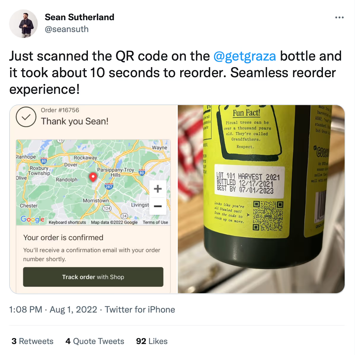
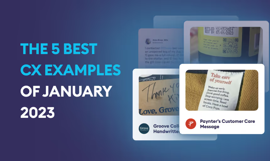
We really love this one. Through the use of a simple QR code, Graza Olive Oil has made reordering its products a breeze.
As this customer was delighted to discover, a quick scan of the QR code featured on the back of their products takes you straight to their website product page, allowing customers enjoying their oil to quickly grab another.
The placement is perfect – right below the best-before dates, which is typically where we look before considering buying a new bottle!
This is a great example of creating a ‘well-oiled’ and smooth customer journey by removing the hassle they may have had to go through to navigate back to a website and reorder. This definitely put them above the competition!
3. Grove Collab: Personalised Messages
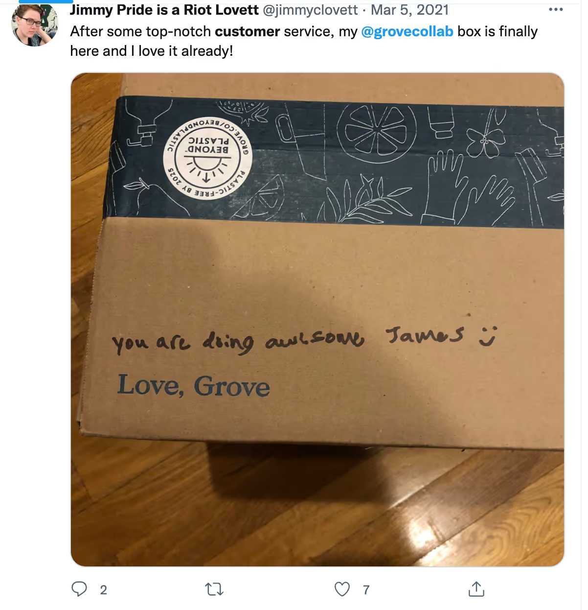
A quick search through Twitter reveals that Grove Collab, a home supplies provider, has some especially happy customers.
The secret? A simple, handwritten, and personalised ‘Thank you’ note that all customers receive upon delivery written by the sender.
This small touch might not seem like much, but it’s encouraged at least five separate customers to voice their opinion on social media, and no doubt delighted many more.
We’re sure to see even more happy customers sharing their new Grove purchases. Great customer personalisation doesn’t always have to be complicated!
4. Chewy: Providing Care during a Hard Time
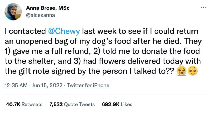
What screams A+ customer experience more than this empathetic, caring action from Chewy?
This customer requested a return on dog food after their dog passed away. Chewy, a pet supplies giant, promptly issued a full refund, an altruistic suggestion of how to donate the food, and finished off with a personal touch: a handwritten note accompanying flowers.
The result? Taking what is clearly a stressful and hard time for the customer into a positive, fluid customer experience and a great establishment of Chewy’s values. Each customer is clearly very important to Chewy.
While this customer did share this experience with social media, it goes to show there may be many more examples unshared.
5. Paynter: Small but Sweet Gestures

When browsing through clothes, you always look at the clothing tag to check your size. Paynter, a US outerwear company, took notice and started including short, sweet, and caring messages embroidered on the label of each of their jackets. They look out for their customers’ well-being in a light-hearted way.
Having this feature on the product itself is a nice physical touch, but it’s also a message that will be repeatedly seen – reminding users that Paynter is a brand that truly cares about its customers, and it’s a clear example of how far a small action can go in the way of building their brand voice, leading to customer trust and loyalty.
Conclusion
We were blown away by January’s examples of how these brands have attuned to their customer’s needs. From small gestures to larger policy changes, it’s clear to see how a brand that cares for their customer can ultimately lead to a higher level of brand loyalty and customer satisfaction.
Make sure you don’t miss a piece of inspiration! Check out even more examples at the CX Swipe File website here, and subscribe to our monthly newsletter to receive updates when new examples are added.




.png)
