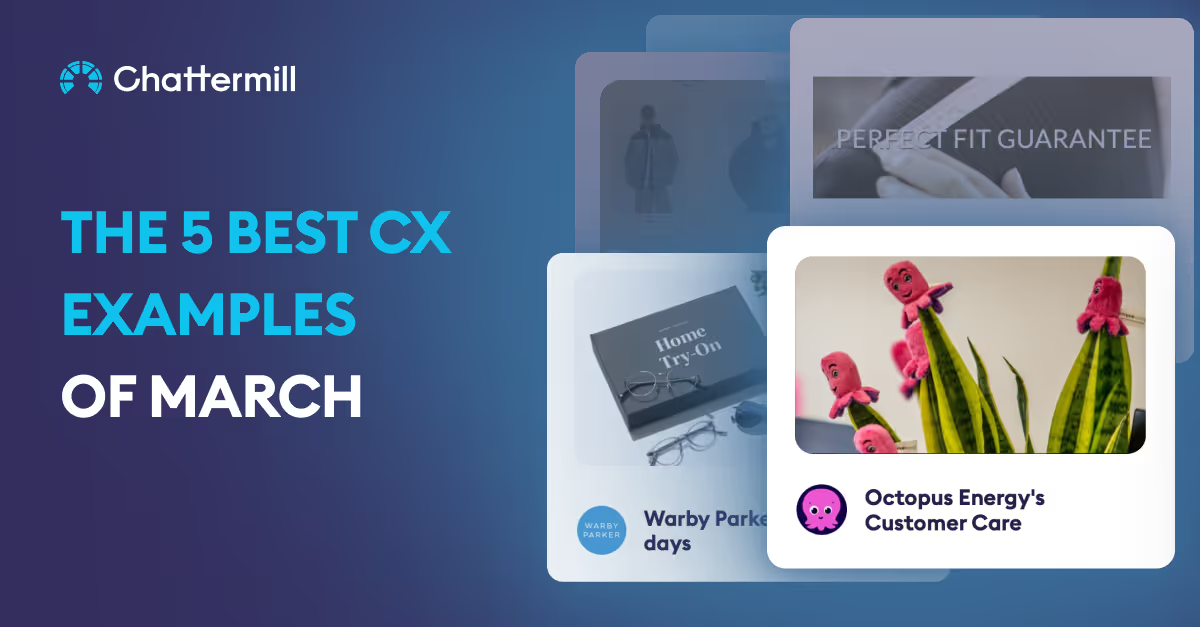
From cost-of-living crisis support to the smoothening out a customer's digital journey, we’ve got a range of fresh examples to inspire your CX strategy this month.
Here are the five best examples across March taken straight from our CX Swipe File.
Know a brand doing something swipe-worthy? Let us promote it! Submit your own examples on the CX Swipe File here, and subscribe to our monthly newsletter to receive updates when new examples are added.
Octopus Energy: Energetic Cost-of-living Crisis Support

For many people in the UK this winter, the rising cost of energy bills has led to difficult decisions and sleepless nights. Thankfully, Octopus Energy has demonstrated that energy brands are able to take a more empathetic approach towards their customers.
After discovering that an Octopus customer had received news of her husband’s terminal cancer diagnosis, they reached out and immediately offered her a more favourable tariff for the following year. They followed this up by ordering the customer an electric blanket, as a more cost-effective means of staying warm.
If this wasn’t enough, a few days later the same customer received a knock at the door, where an Octopus representative delivered her a box of flowers and wished her and her husband well. Personalised CX done right.
Warby Parker: Try Before You Buy!

Shopping for eyewear can be stressful. As well as the regular qualms over colour and design, there’s also the question of fit, head shape, and whether they’ll actually be comfortable to wear.
Warby Parker – the US eyewear brand – has provided its customers with a range of options to help combat this. They’ll ship out 5 pairs of glasses for you to try over 5 days, and will deliver them to you for free – they’ll also include a prepaid return label too.
Hockerty: Perfect Fit Guarantee

Finding a suit that fits is never easy, especially when buying online.Hockerty– the brand that sells upmarket suits – are trying to combat this with a simple trick that its customers love.
Through their ‘Alterations’ policy, they’ll cover any alterations up to 25% of the suit’s cost, encouraging users to take their purchases to a local tailor and have them worked on.
This drastically reduces some of the anxiety when ordering online – and reassures customers there’s some leeway when it comes to getting that perfect fit.
Pull & Bear: Clarity & Cohesion Online

Thanks to fluid, user-friendly website experiences, online shopping is mostly a walk in the park. However, there are a few issues which repeatedly come up.
One of these is accidentally adding too many of one item to your shopping cart. You’ve been there before – you get to the checkout and your total is double what you expected.
Pull & Bear are targeting this problem by making the action completely in your face. When you click to add an item to the cart, the entire screen darkens, and a ‘one product added’ button is clearly visible in the top right-hand corner.
McDonald’s: A Hospital Pick-me-Up

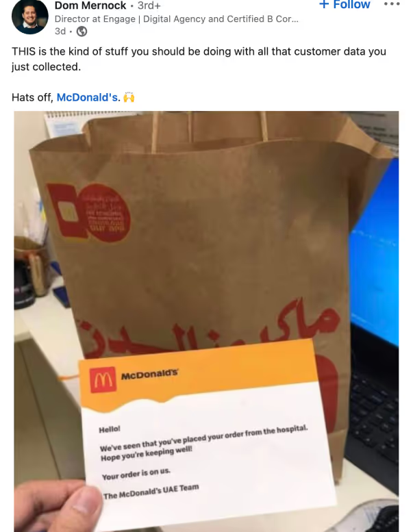
Hats off to this McDonald’s branch in the UAE, who used their customer data to deliver a caring message.
After this customer ordered their food from a hospital, those in-house were quick to notice. They chose to refund the entire order, and wish the customer well with a note inside.
Conclusion
We were blown away by these examples of how brands have attuned to their customer’s needs. From small gestures to larger policy changes, it’s clear to see how a brand that cares for their customer can ultimately lead to a higher level of brand loyalty and customer satisfaction.
Make sure you don’t miss a piece of inspiration! Check out even more examples at the CX Swipe File here, and subscribe to our monthly newsletter to receive updates when new examples are added.


.png)


