Surveys offer companies a ton of quantitative and qualitative feedback into their customer experience.
Those presenting the survey findings need to do so in a readable, succinct way. This is where a survey report becomes handy. A survey report can be shared with a company’s stakeholders leaders, other integral departments (marketing, PR, advertising, and sales), and various teammates.
A survey report pulls any key data and important findings to create a structured story around various issues. The report also offers actionable steps to resolve the issues at hand and helps companies proactively prepare for the future.
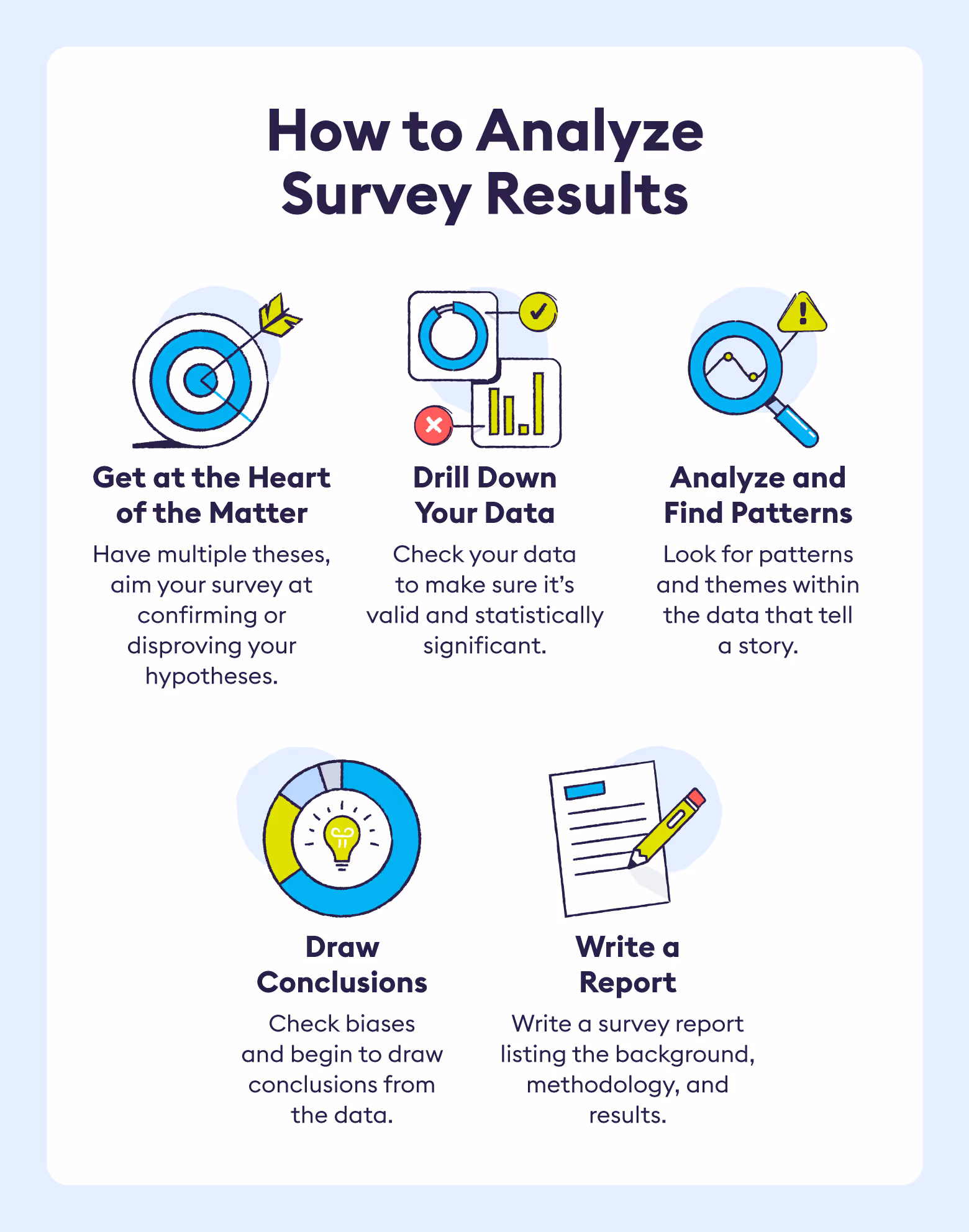
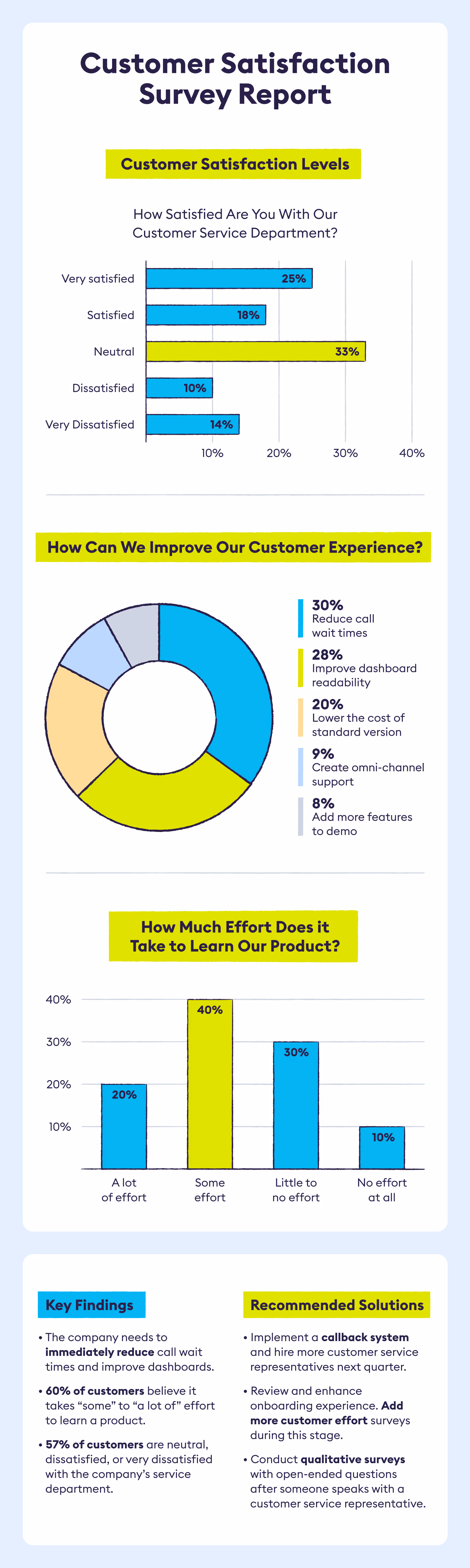
The guide below will discuss the five necessary steps to creating a condensed and thorough survey report that audience members will find interesting and useful. For a quick example of a survey result report see our, visual below.
1. Use A Structured Plan
Like a customer journey map, a survey report needs to have a structured plan. Readers want a formatted structure they can easily follow and jump from slide to slide or page to page without feeling lost. Below is the ideal survey structure:
1. Title Page
The title page should include the following: A short and engaging title, the publication and/or release date, names of those responsible for the report, and a one or two-sentence description.
2. Table of Contents
A table of contents gives the reader a quick overview of the report and allows them to quickly locate sections.
3. Executive Summary
The executive summary is one of the most important sections of the report. It summarizes the report’s main findings and proposes the next steps. Many people only read the executive summary.
4. Background
The background explains the impetus and story behind the survey. It states the hypothesis, question, or issues at hand for why the research was conducted and how the results plan to be used.
5. Survey Method
This section reviews who the target audience was and who the survey actually included. It also reviews how surveyors contacted respondents and the process of data collection. This is often a more technical and detailed section.
6. Survey Results
The survey results section is the meat and potatoes of the report. It provides an overarching theme of the report and underscores any statistical findings or significant takeaways.
7. Appendices
Similar to the methodology section, the appendices section will contain technical data and information about the data collection and analysis process.
2. Visualize The Data
A ton of numbers and statistics aren’t appealing or friendly to the average person. It’s best to present the data in a visually appealing way via graphs and charts.
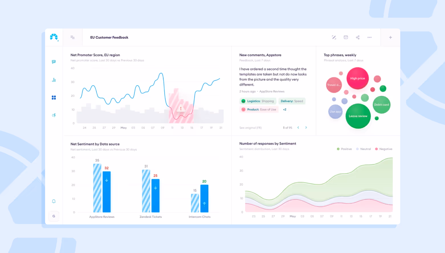
Interactive dashboards are also a nice option if the report is being sent digitally. These dashboards allow readers to quickly glance over findings and to play with variables to see changes in the data.
Our interactive dashboards are great for organizing data and sending customized reports to tell the right story.
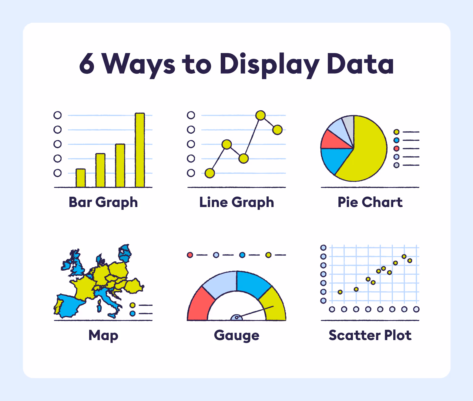
Which Data Visualization Is Best For When
Reports can show data in several ways. However, different visualizations work best for different data sets. The suggestions below go over the benefits of each data visualization. Note, these suggestions aren’t rigid. There’s usually flexibility for how to display data.
1. Bar Graph
A bar graph is best used when one data point is an outlier compared to the other data clusters. It is also useful to display negative numbers.
2. Line Graph
A line graph shows progress or trends over time. Reports should use it when there’s a continuous data set or multiple categories of data to portray.
3. Pie Chart
Pie charts contain static numbers that are a percentage of a whole. They’re best for displaying comparisons. Note, the total sum of all segments should equal 100%.
4. Map
A map displays geographically related data. A survey report should show the proportion of data in each region. For instance, the specific location that the majority of a company’s users are coming from.
5. Gauge
A gauge usually depicts a single value such as a company’s average Net Promoter Score (NPS). Use gauges to highlight extremely relevant figures.
6. Scatter Plot
A scatter plot, also known as a scattergram chart, portrays the relationship between two variables. It’s best when lots of data points exist. A scatter plot helps to reveal distribution trends and outliers.
3. Keep The Copy Simple
A survey report can quickly become too detailed. A good way to avoid overwhelming the audience is to keep the copy brief and simple. Each sentence within the survey report should give the reader new knowledge.
Tabular copy (text in graphs, charts, and tables) needs to be extremely short. The main purpose of the text in the data visualizations and dashboards is to label the data or to serve as a title, subheader, or axis label.
Survey report writers do have more leeway when it comes to headlines. Report headlines should be short, but catchy. Think of headliners as tweets that grab consumer’s attention.
Example 1: Company X increased its Net Promoter Score by 15 points last quarter, causing their Customer Lifetime Value to jump by an average of $281.
Example 2: The CX department lowered its Customer Effort Score (CES) by an average of 36% after the group training.
Lastly, before submitting or presenting a report, make sure it’s proofread and correctly punctuated. Ideally, at least two or more individuals will have reviewed and edited the piece before the final draft is submitted or shared with others.
4. Tell A Unique Story
The executive summary combined with the background section should create an engaging story. Remember, the survey report addresses an issue, takes in feedback, and then suggests solutions.
Here’s an example of how HelloFresh used surveys and survey reports to create an appealing story:
- Character: HelloFresh, a meal delivery service
- Issue or problem: HelloFresh needed to better understand the customer and to synthesize their customer feedback into digestible reports and presentations. These reports also needed to be shared with stakeholders, customer service reps, and both the PR and social media teams.
- Findings from market research: HelloFresh uncovered significant differences in food taste on a hyper-geographical level, e.g., English Canadian vs French Canadian in Quebec and East vs West Berlin. They also found that customers wanted to know what was in their recipes and they requested more check-ins during the ordering process.
- Solutions: They modified their recipes to their consumers’ preferences and added touch points to keep customers informed and up-to-date.
5. Types Of Survey Results Reports
Part of conducting a thorough survey and creating an engrossing report means selecting the best type of survey. Companies must choose a survey type that will give the best customer feedback based on the problems or issues they’re facing.
The list below will help companies determine which type of survey will give them the most reliable results.
1. Real-Time Summary Report
A real-time summary report is typically an interactive dashboard that gives live feedback via charts, statistics, and graphs from the collected survey data.
Best for: Both qualitative and quantitative surveys as they report in real-time.
2. Open-Ended Text Reports
Open-ended text reports use text analytics and sentiment analysis tools to identify patterns or themes from customers’ survey responses.
Best for: Qualitative surveys that contain open-ended responses.
3. Report Scheduler
A report scheduler automatically sends a survey result or report to other users or departments within an organization. Think of them as check-ins. Typically, a CX department uses schedulers to prompt reports for long-running surveys that require check-ins and monitoring.
Best for: Quantitative surveys. A report scheduler can generate overarching quick reports from the collected data.
4. Gap Analysis Report
A gap analysis is best used to analyze two scale-type questions. For instance, if a customer had two interactions with different customer representatives, a customer satisfaction survey could ask them to rate the satisfaction of each. The gap analysis report would then compare satisfaction levels between the two of them.
Best for: Both qualitative and quantitative surveys. A gap analysis report will almost always be a quantitative survey since it should ask the respondent to give a numbered rating. A gap analysis report can become qualitative if a second open-ended question is asked, such as: what made you rate (Employee Name) higher or lower?
5. Spotlight Report
A spotlight report hones in on either one or a target group of respondents. These responses can then be compared to the overall survey responses.
Best for: Both qualitative and quantitative surveys can use spotlight reports since it’s highlighting a small group or individuals’ responses.
6. Trend Analysis Report
A trend analysis report will show significant data currents or tendencies from the past few weeks, months, or even years. A trend analysis report can help businesses modify their surveys by reviewing response rates. Or they can be used to make large overarching themes based on customer feedback.
Best for: Both qualitative and quantitative surveys. Typically, trend analysis reports will offer more insight into quantitative surveys since they’re best for reviewing a large amount of data.
However, with a text analytics tool, qualitative data trends can also be reported on since the text analytics tool automatically creates lots of sentiment data points.
The visual below depicts ways companies best visualize their data in a survey results report .
Both quantitative and qualitative surveys bring in a plethora of insight and data about the customers, specifically, the customer experience. Survey results reports are vital for companies who want to succinctly share findings with both internal and external stakeholders.
Book a Demo to learn about how Chattermill can help you better understand your customer surveys.
Survey Results Report: FAQs
What is a survey results report and why should I create one?
A survey results report is a structured document that presents key quantitative and qualitative findings from a survey. It helps communicate insights clearly and inform stakeholders, offering a narrative that leads to actionable steps and supports data-driven decisions.
What is the ideal structure for a survey report?
Begin your report with a clear title page and table of contents to orient readers. Follow with an executive summary summarizing key findings and recommendations. Include a background section explaining the purpose and hypothesis of the survey, a methodology section detailing how and whom it surveyed, and the results section presenting the core data. Appendices hold technical or raw data for further reference.
How can I present data visually in a survey report?
Use charts and graphs to visualize data in reader-friendly ways. Choose bar graphs for comparisons or outliers, line graphs for trend analysis over time, pie charts for percentage breakdowns, maps for geographic insights, gauges for single key metrics such as NPS, and scatter plots for examining relationships between variables.
How should the language and copy be crafted in the report?
Keep text clear, concise, and focused—each sentence should add value. Labels and titles in visuals should be minimal yet descriptive. Headings should be catchy—think of them like engaging tweets that summarize key insights. Finally, proofread carefully and have multiple reviewers to ensure clarity and accuracy.
How do I make the report engaging and communicative?
Tell a compelling story by combining the executive summary and background: present the issue, highlight what you learned, and show why it matters. Use real-world examples to illustrate how insights translated into improvements—this narrative approach keeps readers invested.
Are there different types of survey results reports?
Yes—tailor the report to your needs. Options include:
- Real-time summary reports, which are interactive dashboards showing live results.
- Open-ended text reports, driven by AI sentiment and theme analysis.
- Report schedulers, which automate sending regular reports.
- Gap analysis reports, comparing responses to paired questions.
- Spotlight reports, focusing on specific respondent groups.
- Trend analysis reports, mapping changes over time to identify patterns.
When should I use a real-time summary report?
Use a real-time summary report when you need an interactive dashboard that updates dynamically, combining quantitative and qualitative data. It’s especially useful for ongoing surveys or monitoring feedback as it comes in.
What is an open-ended text report?
This kind of report analyzes qualitative, narrative survey responses using text analytics and sentiment analysis tools to uncover patterns or themes. It is best suited for surveys that include open-response questions where respondent voices matter deeply.
How does a gap analysis report differ from others?
A gap analysis report compares responses to two related questions—often ratings on different but connected aspects—to highlight discrepancies. It’s quantitative in nature, but can include qualitative context through follow-up open-ended questions.
What business benefit does a spotlight report offer?
Spotlight reports focus on a specific subgroup or theme, offering deeper insights by comparing that group’s responses with the overall sample. They work well for both quantitative and qualitative data and help target interventions for specific audiences.